Get our independent lab tests, expert reviews and honest advice.
Windows 11 hands-on preview
Need to know
- Windows 11 has already started rolling out on some new computers, and will be available as an upgrade for Windows 10 owners in 2022
- It will be free for Windows 10 users
- It looks quite different, but feels very familiar
On this page:
- Windows 11 system requirements
- Windows 11 new user interface
- Windows widgets sidebar
- The new Microsoft app store
- Touch enhancements
Windows 11 is here, but you might not get it right away, even if you want to. The roll-out, which started in early October, will take several months. New PCs will start coming with Windows 11 first, while Windows 10 updaters might have to wait till early 2022.
You might remember Microsoft’s promise that Windows 10 would be the “last version of Windows”. Well, not quite. You can keep Windows 10 going till 2025, but you’ll eventually need to get Windows 11. But it’s not all bad – upgrading will be free if you have a compatible computer with Windows 10 (version 2004 or later) installed.
Windows 11 has a fresh look, fresh sounds, an updated user interface, a range of new features, and perhaps most exciting of all, only one major update per year, among other things.
But there are conditions for entry – the hardware requirements leave behind a surprising number of quite-capable computers.
We downloaded a preview build to get some hands-on experience with what you might be able to expect once it’s officially available to all. We’ve left off commenting on current instability and other pre-build issues that are usually ironed out before a market release.
Windows 11 system requirements
The minimum device requirements for Windows 11 are controversially restrictive, thanks largely to which computer processing units (CPUs) Microsoft considered eligible.
CPUs older than the Intel Core 8th generation or AMD Ryzen 2000 series are unsupported. This makes almost every chip made prior to 2018 – as well as some weaker, but newer CPUs – redundant come the shutdown of Windows 10 in 2025. Some notable exceptions are high-end Intel 7th generation chips, such as the Surface Studio’s Intel Core 7820HQ, but they’re few and far between.
Originally, Microsoft’s justification focused on Windows 11’s reliance on TPM (trusted platform module) 2.0 – a security feature implemented at the hardware level in computer chips. Older chips that support previous versions of TPM don’t make the cut.
After vocal pushback in the media and from users, the company performed additional testing but claims the older CPUs are also prone to crashing and numerous bugs when running Windows 11, so the cut-off remains.
What you need
Windows 11 needs significantly more minimum storage space – 64GB compared to Windows 10’s 20GB (for 64-bit).
You might think this increase of 44GB might not make much difference in an age of terabyte (TB) storage. But many low and mid-range laptops still ship with a meagre 128GB of storage.
Taking into account the space used for Windows itself and programs, plus space set aside for recovery, this leaves those devices with less than half their nominal storage capacity.
Other minimum specifications include:
- 4GB RAM
- 720p HD display resolution
- 9-inch display (horizontal)
- a graphics card compatible with DirectX 12 or later
- UEFI secure boot enabled/capable.
Users of Windows 11 Home edition, which will be most people, need an internet connection and a Microsoft account to install and set up the operating system.
The good news is you don’t need to be a computer whiz to figure out if your PC will work with Windows 11. Microsoft’s PC Health Checker app for Windows 10 looks at your system specs and lets you know.
Windows 11 new user interface
The look
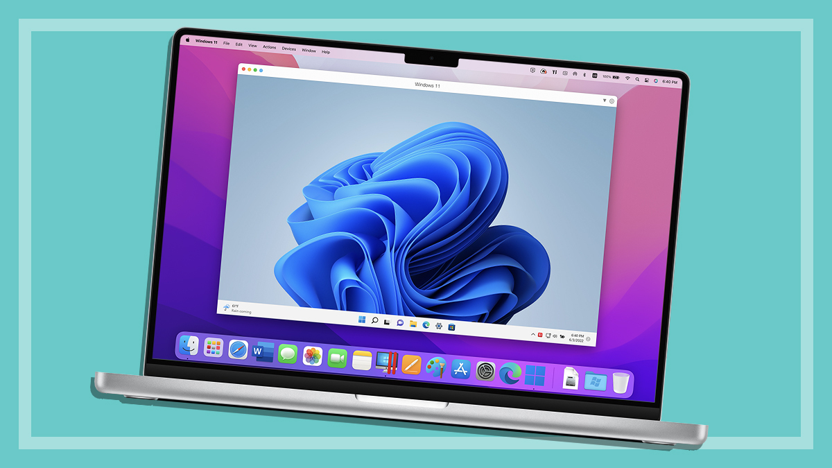
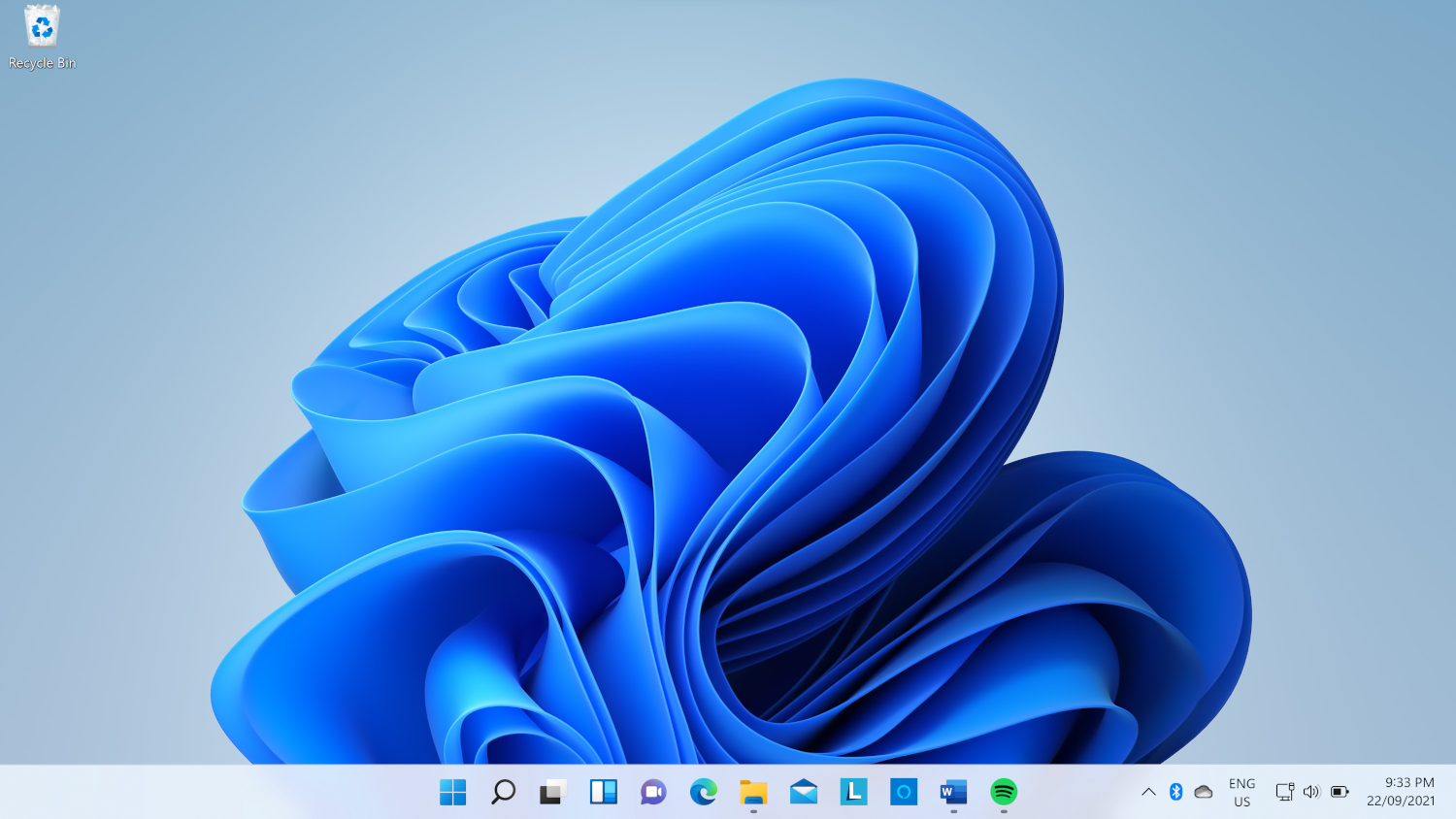
At first glance, Windows 11’s new look might seem like a fair deviation from what Windows users have come to expect, but most of the cosmetic touches are easy to get used to or can be changed to a more familiar layout.
Microsoft swapped out the sharp-edged look of Windows 10 for rounded corners and smooth sliding animations.
Gone are its infamous Live Tiles in favour of more traditional app icons, some of which received subtle updates while others remain unchanged.
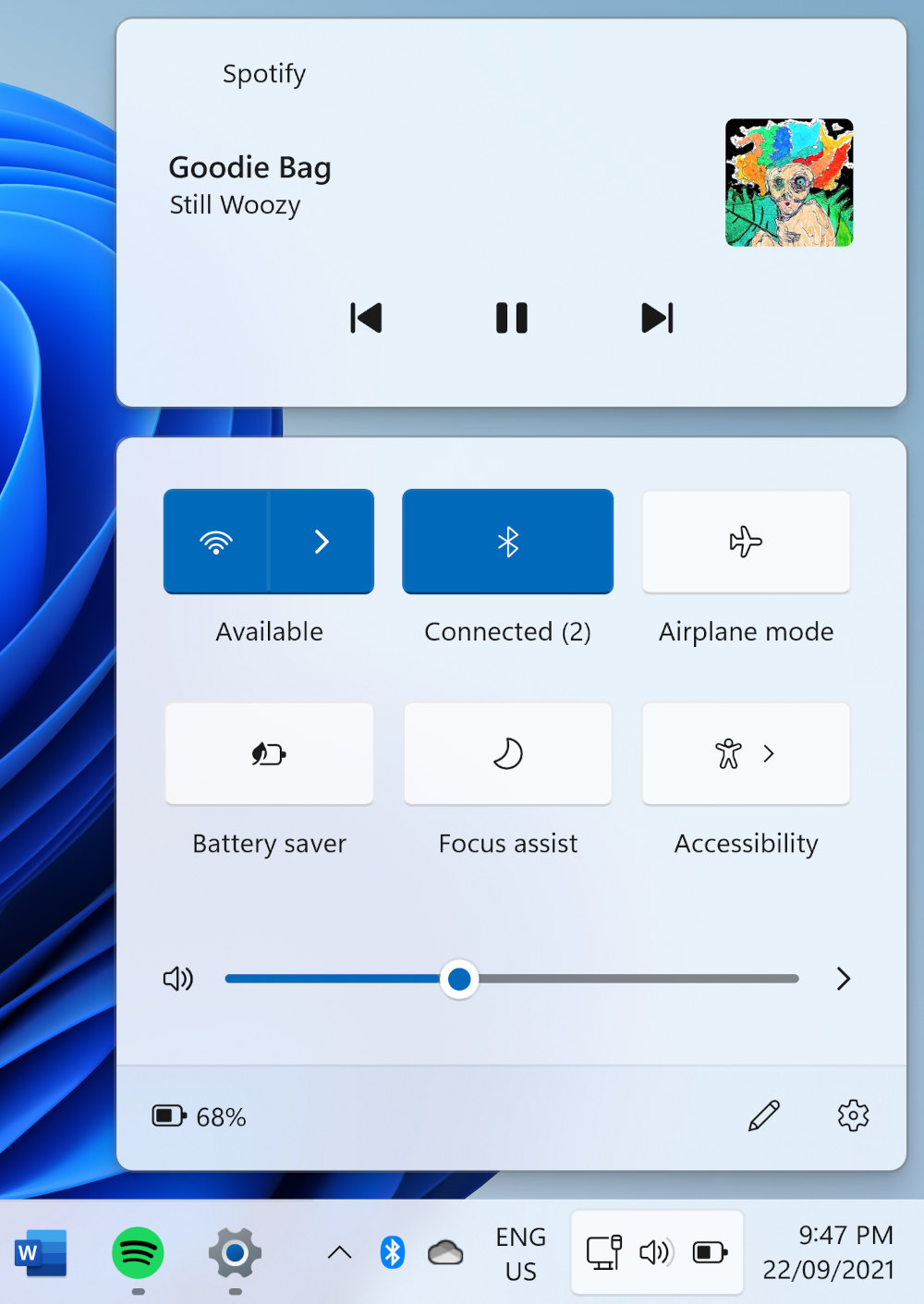
Some overlays now employ a fogged glass look, and the settings menus have undergone a substantial revamp.
Perhaps the most eye-catching change is the centred taskbar, but it can be returned to a left-hand alignment for those who prefer it.
If your own first impressions have sparked thoughts of Apple’s macOS, iOS and iPadOS operating systems, don’t expect this to fade with use.
There are a lot of visual design crossovers, sometimes even feeling like certain elements were pulled straight from the Apple design book.
But despite its makeover, it’s still Windows through and through. It probably won’t take much time to be as comfortable with the basics of this user interface as you were with Microsoft’s previous releases.
Snap Layouts
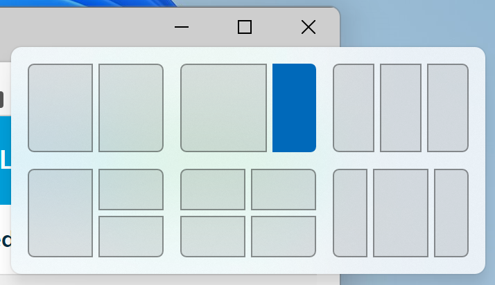
Snap Layouts lets you quickly arrange windows in various configurations, rather than the standard left/right or, on larger screens, quarter-sized snapping of Windows 10. There are only six options right now, but there’s nothing to say this feature couldn’t expand.
Note the snap arrangements featuring three side-by-side windows are only available on screens with 1920 horizontal pixels (such as 1080p) or more. They also disappear if you increase your display scaling too high compared to your resolution.
To use Snap Layouts, hover the mouse cursor over a program’s minimise/maximise button to view the options. Select the section of your chosen arrangement and your window will snap to the corresponding spot on your screen, after which you can select other currently-running programs to fill the gaps.
Once you’ve arranged your windows, they automatically become a Snap Group.
Snap Groups minimise or maximise as a single unit, letting you easily switch between other groups or programs. Right now, a single window can’t be part of more than one snap group.

Some Windows 10 users might already recognise this kind of custom grid layout from programs such as Dell’s proprietary Display Manager for its monitors or from the Microsoft PowerToys feature, FancyZones.
Display Manager and FancyZones have more layout configurations than Snap Layouts, either by default or through creating your own. But given Display Manager’s reliance on Dell hardware, and FancyZones’ status as one of Windows 10’s esoteric (and not pre-installed) PowerToys, Snap Layouts is far more easily accessible to most people.
Virtual desktop backgrounds
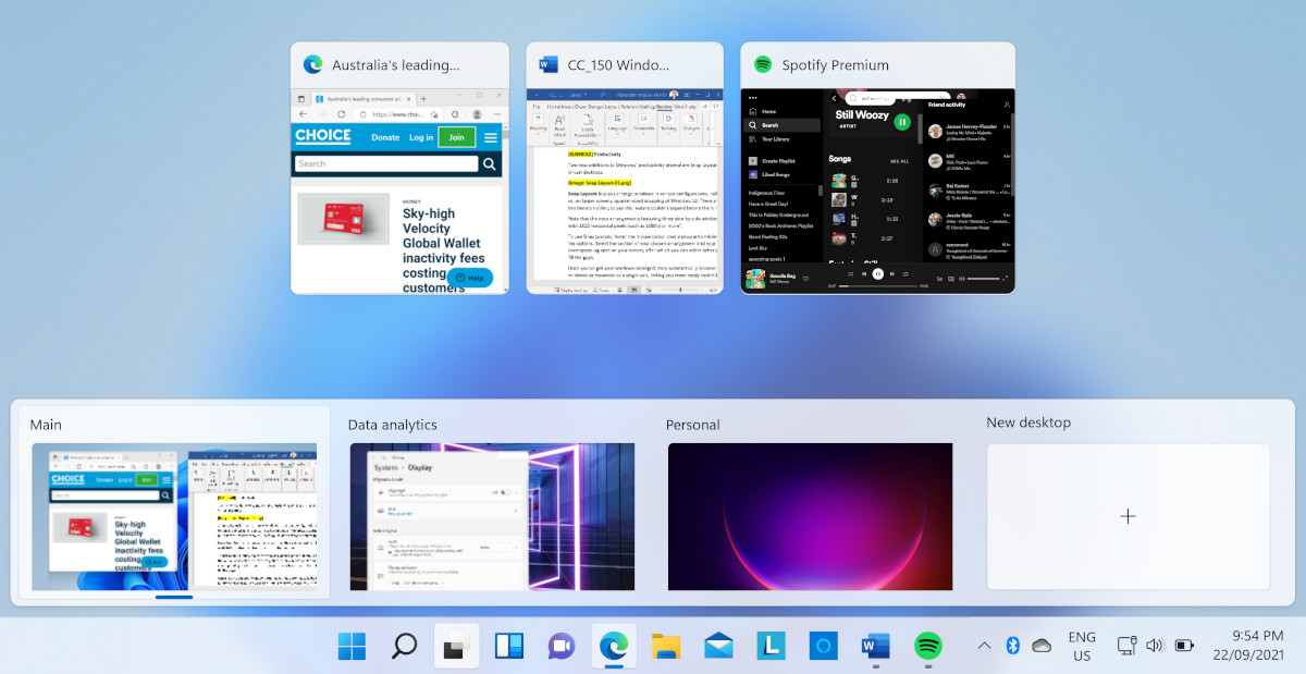
Virtual desktops have received some limited but welcome attention in Windows 11. Aside from the standard UI tweaks seen across the whole OS, you can now set different wallpapers per virtual desktop.
This isn’t the trivial addition it might seem. Setting virtual desktops for different tasks can be a great boost to productivity, and also keep your work and personal lives separate. Knowing which desktop you’re on at a glance, thanks to its wallpaper, can save you filling your entertainment space with work tasks and other complicated projects, or vice versa.
Those who work from home might also enjoy switching desktops as a clocking-off ritual if there’s a clear visual cue to back it up.
Unfortunately, you can’t change colour and light/dark themes per virtual desktop – it’s just background images for now.
Windows widgets sidebar
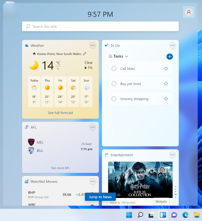
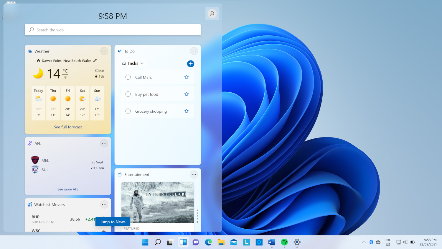
Microsoft has added a Widgets sidebar, which slides out from the left of the screen. Widgets are small interactive panels that show regularly updated information such as news, weather, sport results, your to-do list, and more.
You can add or remove widgets, resize and reorder them, and personalise the news feed section.
Options are currently limited to those made by Microsoft. Third-party widgets might become available in time, but there’s no guarantee developers will take advantage of this feature, if Microsoft even allows it.
As far as how useful they are, it’s so-so. And not just because the selection is spartan.
The side panel slides out when you click the Widgets icon in the taskbar (or swipe your finger inwards from the left side of the screen on touch devices), but disappears when you click outside the panel or use another program, meaning you can only view your widgets while directly interacting with the Widgets sidebar.
This is in contrast to how Android, iOS and iPadOS successfully employ widgets, which can sit on the home screen of a phone or tablet alongside other standard app icons, or how the Windows 10 program Rainmeter allows you to place widgets on your desktop.
Persistent widgets such as those on Android, iOS, iPadOS and Rainmeter allow you to view their information at-a-glance, rather than opening a side panel that doesn’t stick around.
The new Microsoft app store
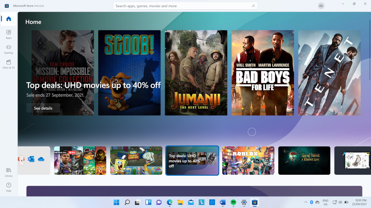
Calling the Windows 10 Microsoft Store disappointing wouldn’t be an exaggeration. Microsoft had lofty goals for its app store/media store/gaming platform/themes hub, but it never took off.
Developers found it difficult to create a Microsoft-approved “app version” of their Windows 10 software. And given they could simply release it the old-fashioned way, designed however they like and without needing to pay income percentages to Microsoft, why bother with the app?
But the tech giant isn’t ready to say die just yet. The new and improved Microsoft Store – also coming to Windows 10 – will make it easier for developers to create compatible software. More importantly, if they use their own payment platforms, or that of a third party, Microsoft won’t touch a cent.
Some big names are already on board. Adobe Creative Cloud, Disney+, TikTok, and Zoom are locked in. And Microsoft will be releasing its own apps such as Visual Studio, Notepad, and the ever-popular Paint, with more likely to come.
Android Apps for Windows 11
Speaking of apps, a range of Android apps will be available on and compatible with Windows 11, thanks to a partnership with Amazon. You can discover eligible Android apps via the new Microsoft store and acquire them via the Amazon Appstore.
The Amazon Appstore is an alternative to the Google Play store for Android apps. It has a smaller range than Google Play, but there are still many options available.
Touch enhancements
Microsoft’s approach to touchscreens for Windows has been uneven at best. Significant improvements have been made since its initial big tablet push with the best-forgotten Windows 8 Live Tile focus, but given the proliferation of Windows 10 hybrid devices, tablets and 2-in-1s that rely on touch to varying extents, it’s long overdue for additional attention.
Windows 11 uses the same gestures for touch as it does for trackpads, such as a three-finger downward swipe to minimise all windows followed by a three-finger upward swipe to reverse it. You can also open your task view and switch between virtual desktops with multi-finger swipes.
It’s easier to snap windows using touch thanks in part to Snap Layouts – when you drag a window to the side of your screen while holding the device in portrait mode, it snaps to the top or bottom, rather than splitting the screen lengthways into two long, thin slivers.
When you fold away or remove a keyboard, your computer automatically enters touch-friendly mode with larger, spaced-out Taskbar icons
When you fold away or remove a keyboard, your computer automatically enters touch-friendly mode with larger, spaced-out Taskbar icons – previously you had to manually switch between desktop and tablet modes. They’ve also increased the size of the hit boxes around windowed programs, which makes them easier to resize with a fingertip.
Regular Windows 10 touchscreen users will have some gesture re-learning to do. For example, swiping in from the left side of the screen now opens the Widgets panel, rather than showing your task view, whereas swiping in from the right side used to open the notification centre and action centre. In Windows 11, the notifications are still there but are condensed, and the action centre has been replaced by a calendar view.

