Get our independent lab tests, expert reviews and honest advice.
Can MySuper dashboards help you find the best super fund?
Experts say these information portals aren't encouraging fund switching.
Last updated: 4 Nov 2020
Need to know
- MySuper dashboards were supposed to help Australians compare super funds
- The Productivity Commission found they are not simple or clear enough
- Super Consumers Australia says more research needs to be done to present the information in a way that will helps people make the best decisions about their super
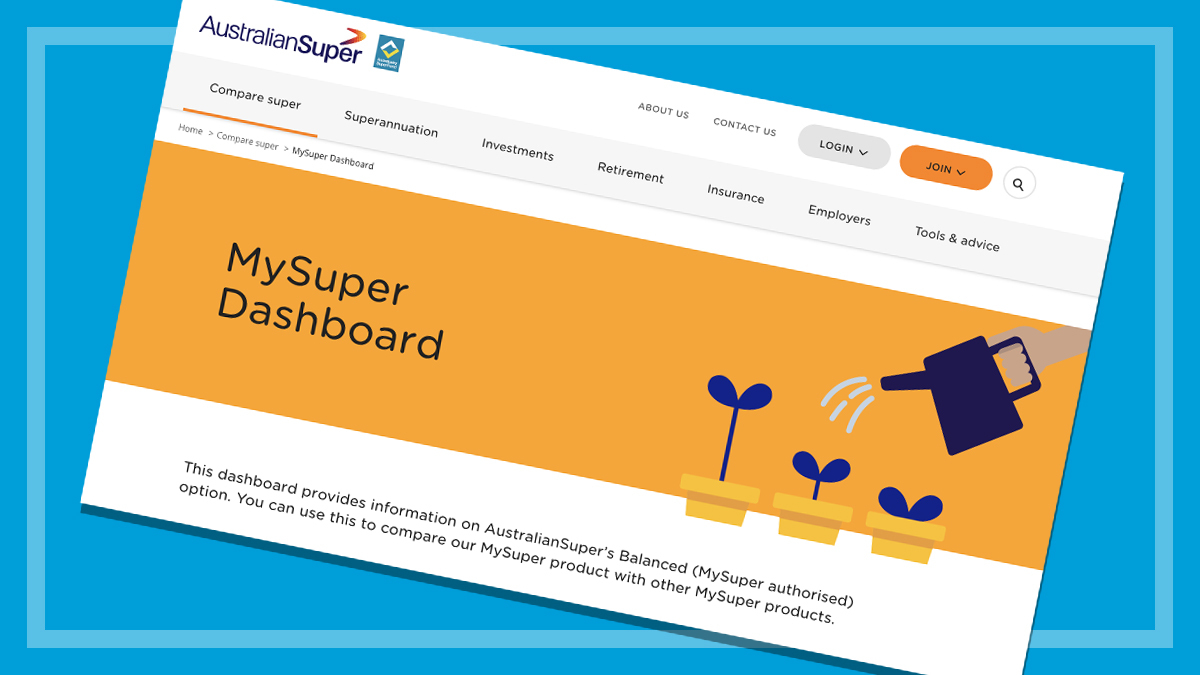
Each super fund with a MySuper product (the ‘default’ super products most Australians are automatically placed in) has to make an online ‘dashboard’ available.
This is a one-page guide on the key features of the fund and how it’s performing.
Funds are legally required to provide certain information on their MySuper product, namely:
- fees and costs
- level of investment risk
- return for past five financial years
- return target
- a comparison between the return target and the returns for previous financial years.
When these dashboards were introduced, they were intended to “allow people to easily compare products and thus make informed choices“.
But it hasn’t quite worked out like this.
“MySuper was aiming to encourage competition in default super,” explains Chrisann Lee, a lecturer at Queensland University of Technology Business School. “But we certainly haven’t seen switching happening as much as originally hoped.”
A recent Twitter poll by CHOICE found the majority of respondents never used the dashboards.
Are the dashboards easy to use?
There is currently no central online location for dashboards and their location on a fund’s website varies from fund to fund.
“Just finding the actual dashboards [is difficult],” says Harry Chemay, co-founder of investment adviser Clover and an ambassador for the Transparency Task Force.
Different funds present this information in very different ways, meaning it can be a complex and time-consuming task to unpack how they compare on performance.
It’s often difficult to even tell which product you’re looking at. Some funds have dozens of similarly named products displayed together on the same dashboard. Other dashboards redirect you to a different fund that is managing the product.
Dashboard differences
Here are some different ways funds report their performance on their dashboards:
- the average of year by year returns as a percentage
- the previous year’s return as a number and also each year’s return compared with the return target on a bar graph
- a bar graph, but with the numbers for each year’s return listed in a different table
Another complication is lifecycle products, which can have different fees and investment strategies depending on the member’s age. At least one fund has a different dashboard for each year of age.
Funds that offer ‘choice’ products currently don’t have to offer a dashboard at all. This makes it even harder for those members to weigh up how their fund is performing in comparison to its competitors.
In theory, if people could easily see how their fund was performing compared to others, they’d be better equipped to switch. This would then put pressure on underperforming funds to work harder to keep their members. But the sector as a whole suffers from a lack of competition.
Text-only accessible version
Are MySuper dashboards helping Australians find better super funds?
The dashboards are one-page summaries of how each MySuper product is performing. They were intended to “”allow people to easily compare products and thus make informed choices”.
But the Productivity Commission recommended that the regulator, ASIC, “seek to revise the content and format of dashboards to simplify them “. This should be done in consultation with independent experts and consumer organisations, it said.
Harry Chemay, ambassador for the Transparency Task Force, says that the dashboards don’t have a consumer-friendly approach. Instead, he says, “they took an actuarial and regulatory approach”.
Super Consumers Australia director Xavier O’Halloran says more refined tools would help fund members make decisions about their super. “If people have information presented in a way that makes sense to them and that they feel comfortable using, they will be better equipped to change funds and put pressure on underperformers to do better with their retirement savings.”
Do we understand how people use MySuper dashboards?
Susan Thorp is a professor of finance at the University of Sydney and was part of a group that conducted experiments looking at how people compare super funds. “In terms of investment performance, the [MySuper] dashboard was not very useful for distinguishing between different funds,” she says.
“You can have a situation where you have a super fund that is persistently underperforming relative to other funds and people will not necessarily pick that up from the dashboard alone.”
This is a concern because being with an underperforming super fund can drastically reduce a person’s retirement savings – in some cases by more than $500,000.
Understanding risk
Another piece of information displayed on each dashboard is the risk level of the super product. It is not clear that this information is easily understood by consumers, or that it helps them make better decisions about their super fund.
Thorp’s research in this area looked into risk descriptions used in different contexts internationally and found Australia’s “performed the worst in terms of helping people choose the best portfolio out of all the metrics we tested”.
Similarly, it’s unclear if the funds’ return target information is useful to members.
Shouldn’t it be up to the regulator to get rid of dud super funds?
Some say that it’s too difficult for the public to determine how super funds are performing.
“I am skeptical on whether the regulator can achieve much by making data more public, largely because members aren’t very well informed and often don’t react,” says Geoff Warren, an associate professor at the Australian National University.
“I’m more [of the view] that informed monitoring of funds by APRA is more effective than trying to create competition at the consumer level.”
Many experts point to the difficulties in gauging the performance of super funds, even when the information is presented consistently and clearly.
“How to pick a portfolio strategy in super is not a trivial decision if you’re not an expert in finance,” says Carsten Murawski, a professor at the University of Melbourne.
‘Lack of competition’
Super Consumers Australia director Xavier O’Halloran says that while the regulator removing the worst performing super funds would help, more refined tools would benefit members making decisions about their super.
“We know there is a real lack of competition in super,” he says.
“If people have information presented in a way that makes sense to them and that they feel comfortable using, they will be better equipped to change funds and put pressure on underperformers to do better with their retirement savings.”
What would a useful tool for super fund members look like?
Thorp says consumer testing is vital in building tools to help people make better decisions about their super.
“The important thing is not just to test how much people understand, but how they then use the information that they’ve been given,” she says.
Harry Chemay also believes that consumer testing is a must.
He says that making a tool which is useful to consumers is “doable” but has not been achieved yet. “It’s just that nobody took a consumer approach to the [MySuper] dashboards, they took an actuarial and regulatory approach.”
The important thing is not just to test how much people understand, but how they then use the information that they’ve been given
Susan Thorp, professor of finance, University of Sydney
Industry body ASFA has previously voiced support for further consumer testing of MySuper product dashboards. The Institute of Actuaries of Australia also stressed the importance of consumer testing these dashboards.
Murawski says that simply providing more details about fund performance could lead to information overload.
This aligns with the Productivity Commission’s finding that a ‘less is more’ approach would provide more meaningful information to super fund members.
“The question is, what sort of information would you need to make available and what sort of support would you need to give people so that they can make good choices?” says Murawksi.
In the 2020 federal budget, the government announced the implementation of a ‘YourSuper’ tool which aims to rank super funds on performance and fees.
O’Halloran says the tool could help people get more out of their nest egg.
“The ‘Your Future, Your Super’ reforms are a good start to ensuring that all Australians get a fair deal from our superannuation system,” he said.
“We look forward to working with the government to implement these reforms.”
What did the Productivity Commission say about MySuper dashboards?
The Productivity Commission recommended that the regulator, ASIC, “seek to revise the content and format of dashboards to simplify them and provide more easily comprehensible metrics”.
This revision should be done in consultation with independent experts and consumer organisations, it said.
Further, it recommended ASIC bring the dashboards together to a single location. This website could prompt members to compare their fund with others and see how it’s performing, as well as offering members an easy way to switch.
More research is needed, says Super Consumers Australia
“The heart of this issue is that we need a better understanding of how people use the dashboards and similar tools around super fund performance,” says O’Halloran.
“There’s a need for more work to be done to better understand what information exactly would help people make better decisions about their super and, ultimately, get the most out of their retirement savings.”
Disclosure: Susan Thorp is a Super Consumers Australia board member.